
Clashing colors can be a real fashion faux pas. Follow this guide to harmonize your hues.
If you peek into your closet and come face-to-face with a sea of neutrals, navy, and black, you’re not alone. Many people struggle with incorporating color into their wardrobe staples. The primary reason? They’re not sure what clothing hues work well together, what the rules are for mixing and matching, and which colors they can best use to their advantage.
But there’s good news: There’s a science to color mixing (discovered by none other than Sir Isaac Newton himself—seriously). Holding a prism by a window one sunny day in 1666, Sir Isaac Newton proved that light refracts into a rainbow spectrum. He then displayed the natural progression in a circle (the color wheel), which turned out to be a handy tool for painters and other artists looking to create harmonious color schemes.
Today’s iteration of the color wheel has evolved to include in-between tones (like yellow-orange and blue-green) and warm and cool versions of key shades (like warm orangey red and cool bluish red). Using the wheel, you can experiment with basic color schemes to put together an eye-popping and flattering outfit. Try the following artist-approved color schemes to find your ideal wardrobe palette. Here’s how.
1. Monochromatic

Why it works: Light and dark variations of one color blend beautifully. (Picture a paint-chip swatch.)
For best results: Wear dark shades on the parts you would like to downplay and lights, which catch the eye first, on the areas you want to play up. Mix textures (say, satin with knits) to give the look depth.
Bold option: Wear one knockout shade like red (a cayenne sheath and matching pumps) to turn an outfit into an exclamation point.
Mellow option: Subtle tone-on-tone combos, like an orchid skirt with a lilac blouse, have “a soothing watercolor effect,” says stylist David Zyla, the author of Color Your Style ($18, amazon.com).
2. Complementary
Why it works: Opposites on the color wheel are such a huge visual contrast that they enhance each other. Red, for example, looks brighter when paired with green. That’s why leafy tones flatter redheads so well.
For best results: Use about 75 percent of one color and 25 percent of the other. Donning two hues in equal proportion can look like a sports uniform, says Kate Smith, the founder of Sensational Color, a color-consulting firm in Ashburn, Virginia.
Bold option: Cinch a soft blue cardigan with an orange belt. But don’t overdo the accents. If you also throw in a flame-colored bag and shoes, “the eye will be drawn to too many areas at once,” says Leatrice Eiseman, the executive director of the Pantone Color Institute. Supplement the outfit with neutrals.
Mellow option: Paler complements are still energizing and are easier to pull off than vivid, primary-based combos, says Eiseman. Highlight a mint blouse with baby pink bangles instead of gold.
3. Analogous
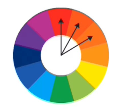
Why it works: Neighbors on the color wheel flow effortlessly together. This scheme is a stunner in nature, too. (Think sunset shades.)
For best results: Let one color take the lead, and give the others supporting roles. “Asymmetry is more interesting,” says Eiseman. Avoid combining bolds and pastels (like red and peach) because the brighter color makes the muted one look muddy.
Bold option: When you want to turn heads, opt for uniformly saturated brights. For instance: a poppy-and-tiger lily floral punched up with hot pink flats.
Mellow option: Low-key analogous medleys look especially ethereal. Try a pale purple tunic and a teal scarf over light denim.
Why it works: Two analogous colors (neighbors get along) are joined by one complementary color (opposites attract) for a grouping that has an unexpected, nuanced feel.
For best results: Use the two adjacent colors as one dominant shade and the opposing color as the “surprise,” says Zyla. Again, aim for a ratio of 75 percent to 25 percent.
Bold option: Chances are, the patterned items in your closet have a built-in split-complementary or analogous scheme. So just draw out, or add, an accent. A print blouse in deep blues and purples gets enlivened with orange earrings.
Mellow option: An earthy purple tee with a thistle purple sweater is drab until you add a saffron scarf.